When adding a measure to the Color drop zone, you may specify the logic which should be used to drive the color in the visualization. This enables users to define the meaning of the color component in the visualization. For example, if the color component displays profit, you may want to select the Positive Negative color logic, to see at a glance where a profit or loss was made. On the other hand, if you're measuring sales growth, you might select Linear.
Add Color Logic
To open the Color Logic menu and select color logic for charts:
- Add the measure to the Color zone.
- Either drag the measure up over the Color zone header, or click the Color zones small triangle (next to the ellipses) to expand the Color Logic menu.
- Drop the measure chip onto the required logic type.

When working with grids, start by selecting which grid component should be driven by the color logic:
Background: drives the color of the data cells.
Foreground: drives the color of the text in the data cells.
Indicator: drives the color of the indicator.

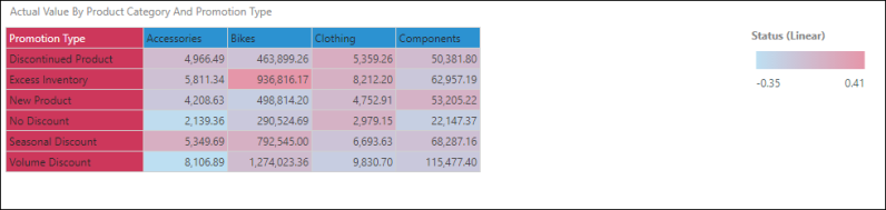
Linear
A linear color ranking according to values.
Logarithmic
A logarithmic color ranking according to values.

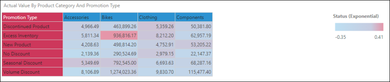
Exponential
An exponential color ranking according to values.
Standard Deviation
Finds the standard deviation and colors the values according to their dispersion from the mean.

Value Quartiles
Divides the values into quartiles and applies color accordingly.
![]()
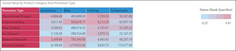
Rank Quartiles
Splits the values into quartiles according to rank.
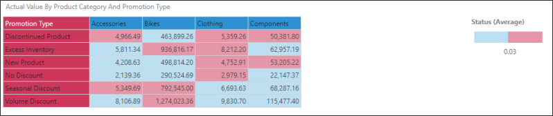
Average
Finds the average and colors the values according to whether they fall above or below the average.
Positive Negative
Indicates whether a value is positive or negative.

Percentage of Max
Provides a color ranking indicating 0 to 100% of the maximum value. In this example based on a percentage growth KPI, the maximum value is the status with the highest growth rate.
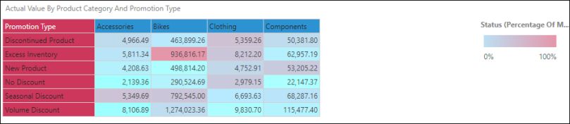
In the next example, the grid shows product sales by promotion type, but is not based on a KPI. Sales has been added to the Percentage of Max color indicator. The maximum value here is bikes sold with volume discount, so every other value is measured as a percentage of 3,745,257 and color coded accordingly.

Discrete
This option is used when creating combo charts, to set contrasting colors to easily compare values in the chart. Each measure is labeled in a discrete legend.

Custom Colors
Custom Color functionality is used to leverage custom color logic that has been configured in the database. To learn about Custom Colors logic, click here.
Advanced
Advanced color capabilities are used to customize and manipulate dynamic bands and colors for KPIs. For information about Advanced colors, click here.